
What this tool helps you investigate
Use the market strength map to compare sectors or stocks with a chosen benchmark using normalised relative strength and momentum change. It highlights leading, recovering, fading and lagging groups.
The trail records how a point reached its current position. A change of quadrant is a model description of relative behaviour, not proof that investment capital moved between sectors.
Read the workspace
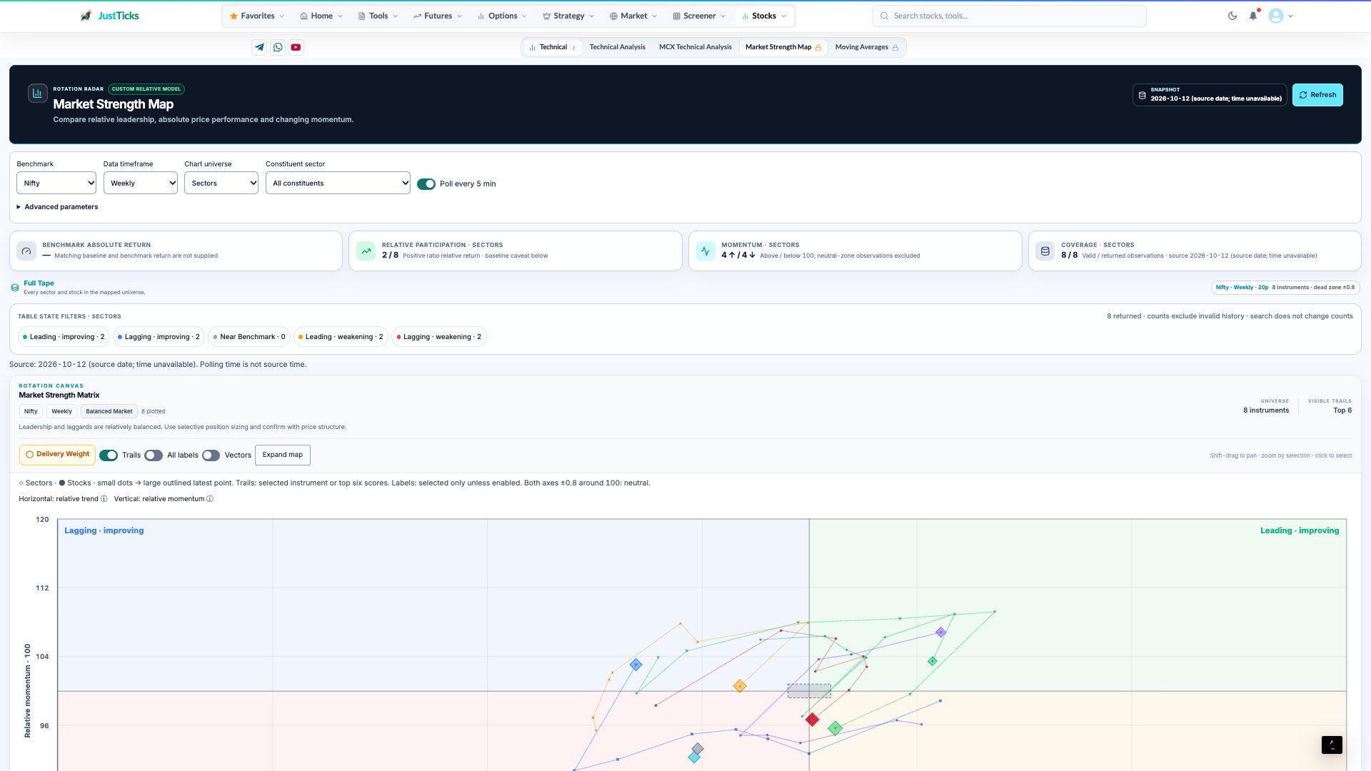
- Benchmark and timeframe. Relative leadership depends on both the comparison basket and sampling interval.
- Source date. The source date is different from the time the page was polled or refreshed.
- State filters. Leading, lagging and improving states are model-relative classifications.
- Rotation trails. Both axes and the trail history matter; the map does not directly measure fund flows.
Choose the instrument, contract and observation window before interpreting the results. Read the source timestamp and any empty-data message in the live tool.
How to use Market strength map
- Choose the benchmark, timeframe and lookback.
- Choose sectors or stocks and set the required filters.
- Inspect the current state and its recent trail together.
- Use delivery context and the ranking table to investigate the inputs behind a point.
Understand the measurements
| Measurement | How to read it |
|---|---|
| Relative strength | Normalised performance against the selected benchmark. |
| Momentum change | Change in relative pace rather than absolute price direction alone. |
| Strength score | A composite rank based on the tool inputs, not a forecast probability. |
| Dead zone | The model has an area near the benchmark where it avoids assigning a rotation signal. |
A worked example
A stock can outperform a falling benchmark while its own price declines. If the benchmark loses 3% and the stock loses 1%, it is relatively resilient; that is different from positive absolute performance.
This example explains the calculation or reading process. It is not a current market observation or a trade recommendation.
Checks before drawing a conclusion
- Compare the same benchmark, timeframe and lookback before reading point positions.
- The API does not expose every baseline alignment detail, so avoid claiming an exact return replication.
- Model states and delivery-flow proxies do not identify institutional buyers.