
What this tool helps you investigate
Use the ETF heatmap to compare the price behaviour of covered ETFs across short and longer horizons. Category leadership helps separate, for example, banking exposure from gold or international equity exposure.
The workspace offers different return and momentum views. A model score summarises the inputs used by that model; it is not an expected return or a probability.
Read the workspace
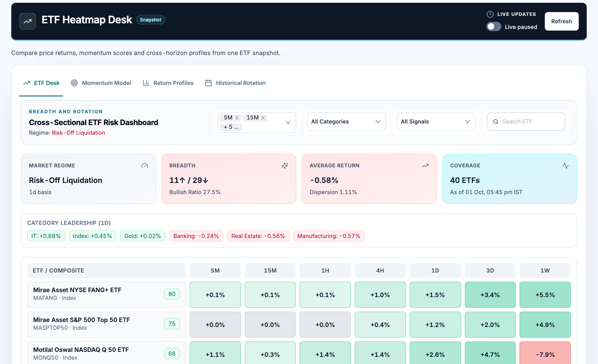
- Workspace tabs. ETF Desk, Momentum Model, Return Profiles and Historical Rotation answer different comparison questions.
- Filters. Select horizons, category and signal filters before comparing the visible ETFs.
- Breadth. Advancing and declining ETF counts describe the covered list, not the entire stock market.
- Return matrix. Read each horizon column separately; a positive daily return can coexist with a negative weekly return.
How to use ETF heatmap
- Choose comparable horizons and the ETF category of interest.
- Read coverage and the source timestamp before interpreting breadth.
- Compare a row across horizons to distinguish a short rebound from broader persistence.
- Review the ETF benchmark, traded liquidity and price-versus-NAV relationship separately.
Understand the measurements
| Measurement | How to read it |
|---|---|
| Horizon return | Price change over the labelled period. |
| Breadth | Covered ETFs with positive versus negative daily returns. |
| Average return | A cross-sectional summary of the covered ETF snapshot. |
| Momentum score | A relative model output whose inputs should be read in the Momentum Model view. |
A worked example
An ETF can be up 1.5% over one day and 5.5% over one week while showing little movement over the last 15 minutes. This is longer-horizon strength with a quiet latest interval, not a contradiction.
Worked example
This example explains the calculation or reading process. It is not a current market observation or a trade recommendation.
Checks before drawing a conclusion
- Check the source time and coverage before comparing ETF rows.
- Price returns can differ from total returns including distributions.
- Overlapping ETFs may represent the same underlying exposure and are not independent confirmations.